The Myth of Timelessness
As a student and practitioner of interior design, I have consumed a freakish - near obsessive - amount of design-related writing. What I’ve come to realize is, the more I read, the more it all starts to sound the same. Authors and journalists are trying to reach the largest audience possible and while there are a few outliers who go out on a limb with an actual point of view, the results are increasingly disappointing and chock full o’ weak takes. Insights or turns-of-phrase that have been repeated so much that they rely on their redundancy as proof of fact, never really fleshing through the idea and leaving us, the readers, with a general sense of vagueness and more questions.
What I’ve been mulling over lately is the advice to invest in “timeless” pieces or choose a “timeless” design, the logic being that you don’t run the risk of wasting your hard-earned money on a passing trend. Many designers will also market their approach as “timeless” as a way of imparting their wisdom and earning your trust. Okay. Fine. But what exactly is timeless?
The textbook definition is “seemingly unaffected by time; ageless” or something that endures. This makes sense at first. Until…you try to come up with an example. Then you run into the problems of contingency; context, geography, intention, value systems. Even if you were to examine “older” items like antiques as surely timeless, there are still countless styles, locations and eras to work through. Timeless is different for everyone, which means that particularly in the application of interior design, it’s….meaningless.
For the sake of argument, let’s examine what might be referred to as timeless - something we can all generally agree on, like wood floors. You love them, I love them, real estate agents love them, etc. Right? Wrong. What about orange-hued skinny planked red oak with high-sheen varnish? Hmmm. Or bamboo parquet flooring? Eesh. What about espresso-stained 6” wide planked with questionably “hand-scraped” patination? To some, this is dated and norm-core, fodder for real estate listings, akin to granite countertops. To others, it signals upward mobility. What about even wider 9” Dineson Douglas fir planks with an oiled finish? Very high-maintenance and very specific - might not be suitable for a glamorous maximalist space or a family with young children.
Once you start to get into details (which you must because design is decisions) timeless actually turns into its counterpoint - personal. It becomes about your references, what you’ve been exposed to, what you allow yourself to be influenced by, what your aspirations are, what your reality is. If you’re looking to timelessness to make a “safe” choice, then you’re missing the point of design. Design is an answer to a problem, the problem being, how to make an interior suit your life within your budget and your timeline. This is different for everyone. If that weren’t true, then everything everywhere would look exactly the same for all of time.
If you want to understand how timeless can pertain to you, you have to be willing to do an investigation on yourself. You have to think about the things that you return to over and over again. You have to think about why you come back to things over and over again.
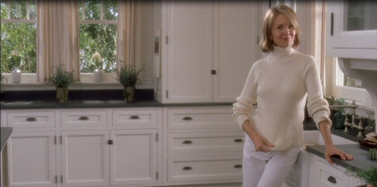
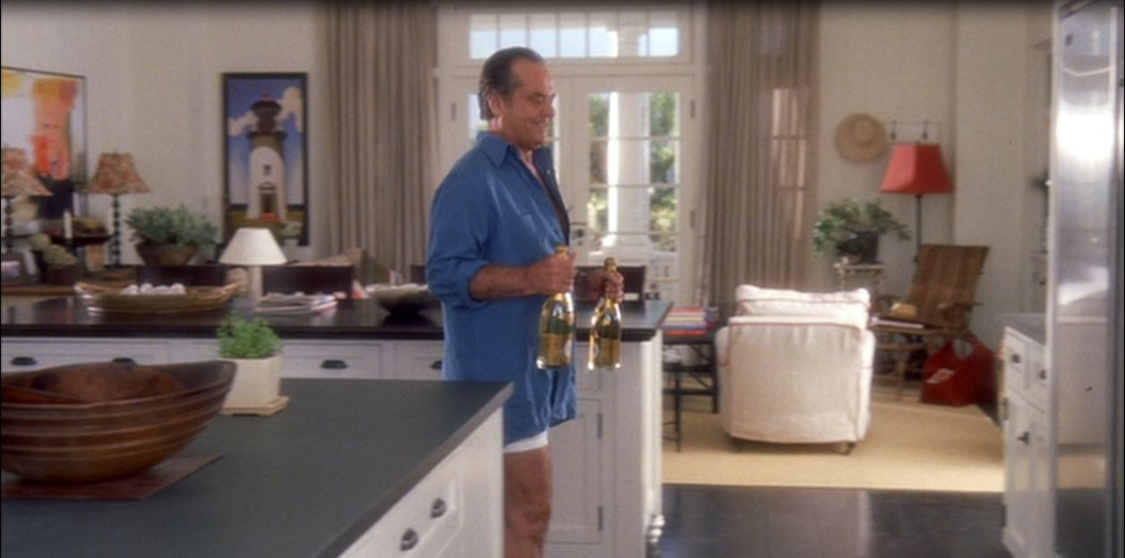
One of the reasons why I get bent about the request for “white kitchens” is because they’re marketed as timeless but honestly, they’re not. Too vague! When people reference this, they’re likely thinking of America’s sweetheart of kitchens - namely, Nancy Meyers Hamptons kitchen in “Something’s Gotta Give.” Let’s compare this to a few white kitchens I found on Houzz.
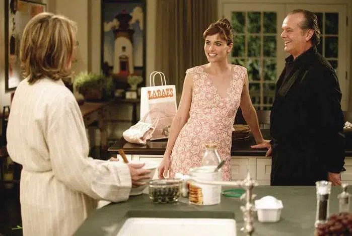
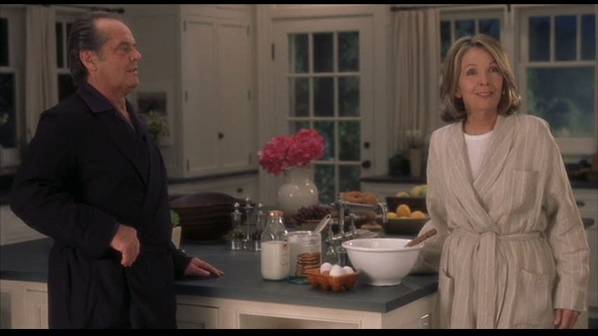
Something’s Gotta Give kitchen set, design by Beth Rubino
Houzz Kitchen 1
Houzz Kitchen 2
The subtleties are numerous, but for me, even if they’re all white kitchens, they are miles apart in feeling. Houzz Kitchen 1 is cold, shiny and feels like an ice skating rink, with lighting that screams for attention like a petulant child. Look at all these crystals! Shiny chrome! The contrast is also not evenly and sensitively distributed - the floors read like a heavy dark bottom and everything up top is a noxious bright white, with nothing in between. Houzz Kitchen 2 is full of small heart-breaking disasters like mismatched toekicks, floating upper cabinets disconnected from a top-heavy hood that has neo-traditional pastiche detailing, pendants that are so close together they look a bit cross-eyed, a tray ceiling that does - what exactly? Both kitchens are devoid of the elements that make Meyers’ kitchen so appealing. People, life, warmth, and expert styling. Styling that looks like oh gee whiz this old thing! Like French girl fashion. When actually it’s extremely considered and contrived because it has to be - it’s telling a story. Writers don’t just haphazardly write details, they edit. The same goes for set decorators. There is a great attention to texture variation, balance, rhythm - all principles of design that when done well don’t feel “done” at all.
Generally speaking, Nancy Myers films are extremely well-rounded in their attention to detail - the houses, the outfits, the prop references (see - Zabar’s bag) - their ability to signal “the good life” is almost obscene and why they have such lasting power. That and, Meyers is tapping into a strong collective fantasy, bordering on delusion. Her narratives are as far-fetched as Jane Austen’s. Tell me how often an older woman can not only tame an old entertainment tycoon Lothario, but snake him away from her insanely beautiful daughter, and basically wave off a complete catch of a younger man - a high-income earner who is warm, supportive, and Keanu Reeves. She’s also a divorcee who gets along comically well with her ex and is a successful writer - no wait, even more special - a successful playwright. She’s always presentable, slim, and her hair looks freshly (professionally) blown-out. The kitchen is the soul of this fantasy and it’s VERY seductive and transporting. It represents the privilege of safety and access that money and social standing more or less guarantee, and it’s set in one of the most exclusive beach communities in the Unites States of America - the Hamptons. It’s casual, breezy, fresh, and yeah - white. Ultimately the kitchen speaks more to common aspirations. The sham is that the dream comes packaged together, which is why so many bland white kitchens miss the point (not to mention the design details and styling, ha).
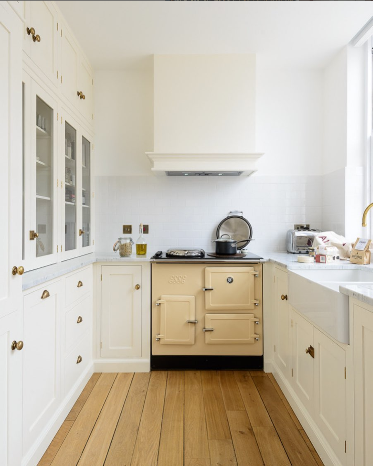
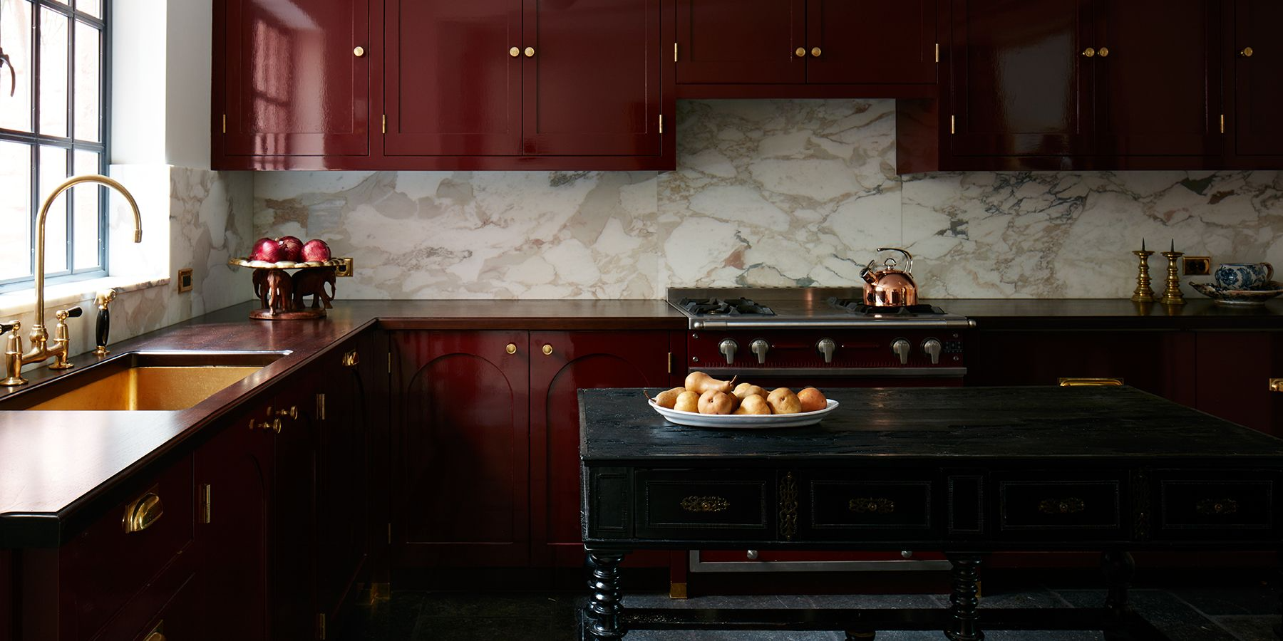
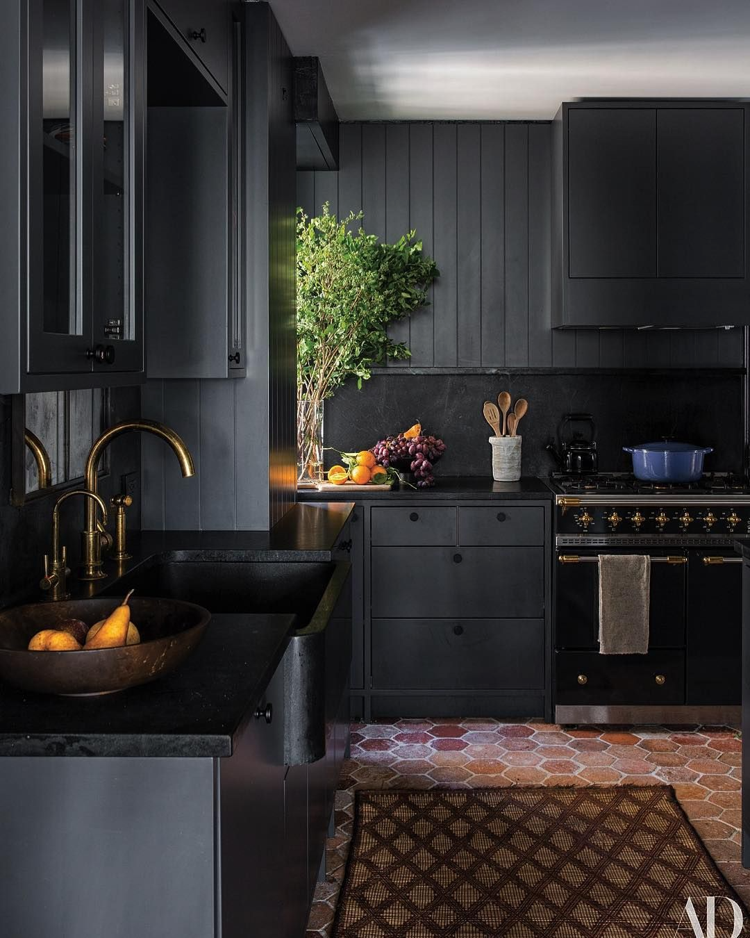
By the way, it’s entirely possible that your version of timeless is in fact, a white kitchen. I’m not against white kitchens, when done well. White is reflective, it bounces light marvelously around a room. It’s also easy to see dirt, which is some ways makes it easy to clean (or rather, easy to communicate “cleanliness”). White is clouds, cosmos, hydrangea, crisp sheets, young teeth, healthy nails, swans, egrets - I can go on. It absolutely is appealing but it’s not the only option. There are myriad beautiful and peaceful shades of sand, rich and soulful earth tones, handsome and mysterious inky blacks.
A poetic mixed whites kitchen by DeVol Kitchens
Lacquered red kitchen by Fernando Santangelo
Sooty kitchen by Ashe + Leandro
Ultimately, “timeless” is nebulous - self-help blather OR proxy for choosing something safe or inoffensive, and I don’t think that even exists and if it does, you are allowing someone else to spend your money, you’re letting your insecurities dictate how to live, rather than your values or your personal inclinations. Instead, remain curious about what’s out there and see if it’s for you. Remain steadfast, bat away capitalism’s swinging pendulum and opt to invest in yourself instead.
DR
